Blog

  • Our New Sponsor: Fine Grime

    I would like to introduce the newest sponsor to the site Fine Grime Art Publishing House, located in Bath UK. If you head over to the site you will see that they carry fine art prints from such artists as Bask, Ben Tour, Natalie Shau, Carles Gomila, Sylvia Ji, Zoe Lacchei, Paul Lemmon(shown), Russ Mills (Byroglyphics) and many more. There will also be some new editions soon from Nom Kinnearking and Regino Gonzales, both amazing artists.

    So if you have been looking for prints from some of these artists, or have never seen some of the work before, make sure to check out the site. Fine Grime Ltd

    paullemmon_Off_the_hook

  • “Skull” print by Chip7 @ Flatcolor

    Flatcolor Gallery has just added a new print by Chip7, who also has some work in the current exhibition at the gallery. The print is 9″ x 7″ on a 10″ x 8″ piece of Hahnemuhle William Turner Fine Art Paper. The print is limited to an edition of 25. The print is very colorful, and I like how the myriad of shapes and colors all come together to create a skull that might not necessarily look like a skull for every viewer, which is a nice effect.

    Chip7 @ Flatcolor

    chip7_skull

  • “Wolfman” print by Joel Mills

    Here is a fun print that was added to the Gigposters classified. “Wolfman” is a 3 color screenprint on 100lb French paper. It’s 12.5″ x 19″ in an edition of 20 for only $12 ($5 shipping).
    It’s quite an amazing print, and really looks convincing as an old daguerreotype photo. With only three colors, Black, Bronze (Metallic) & Sepia Brown, the image looks really intricate. It says this is second in a series of three, Dracula being the first. Does that mean that Frankenstein is next? I sure hope so.

    Head on over and check out the print and keep your eye open for more: Joel Mills @ Gigposters

    wolfman_joelmills
    wolfman2_joelmills
    wolfman3_joelmills

  • “Skull Study” print by Brian Ewing

    Brian Ewing has just released a new giclee print. It’s based off of a skull study drawing that he did a little bit back. The original sold instantly, so for those that missed it here is another chance. The print is 5″ x 7″ on German Etch Watercolor paper, and is all framed (8″ x 10″) and matted. The print is signed and numbered in an edition of just 10 for $45.

    The print quality looks outstanding, and seems to have retained all of the qualities that graphite drawings have. Head on over and get it here, won’t last long. Brian Ewing Store

    skullstudy_brianewing
    skullstudy2_brianewing

  • “Somewhere Over the Rainbow” print by Charlie Owens

    Charlie Owens has just added a new screenprint to his Etsy shop. This new print is an 18″ x 25″, 4 color print on 80lb paper. Each print is signed and numbered in an edition of 38 for $35 a pop. I really dig the muted colors against that cream paper. His past few prints have had texture running throughout them, but this one has a very clean design which fits this image quite well.

    Charlie Owens @ Etsy

    somewhere_charlieowens

  • Review: “Madonna and Horsefly” print by John Brophy

    Review: “Madonna and Horsefly” print by John Brophy

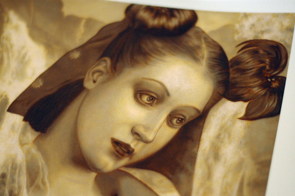
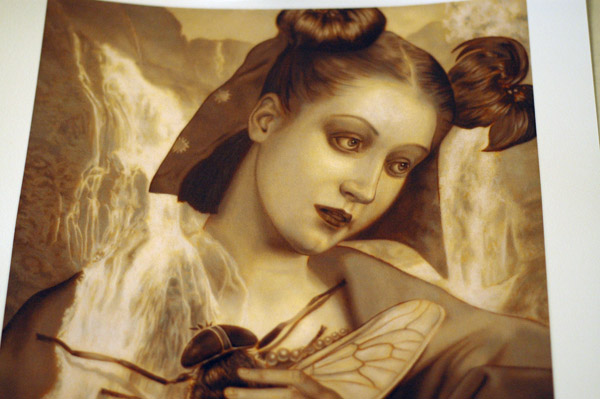
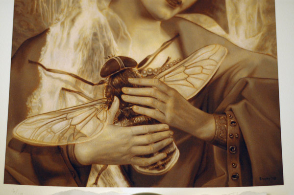
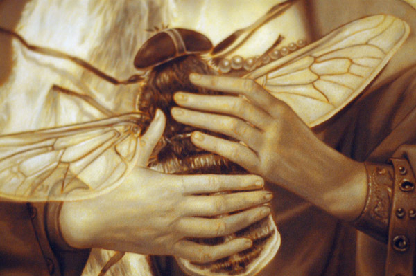
    I started out the review section in order to talk about prints and collectibles, but haven’t really had the chance to do this for far too long. I was able to get a hold of John Brophy’s “Madonna and Horsefly” print that can be found at Roq la Rue and felt it deserved a review. The print is on heavy watercolor stock, 10 3/4″ x 13 1/4″, with a paper size of 13 1/4″ x 15 3/4″. It is signed and numbered in an edition of only 10 for $150.

    The print is shipped rolled in a heavy duty tube, even with some padding on both ends to protect it. The quality of the print is outstanding. The paper is heavy/durable and has just a little bit of tooth to it that is really only noticeable if you touch it. While the image is done in the style of a Flemish underpainting, I think the choice to not print onto canvas was a good idea. As you can see in the first photo there are little touches of burnt sienna showing through, but this was taken with a flash. The photos after were taken with natural light and now you can see the print is pretty much flooded with burnt sienna. It’s a very unique effect and for me only adds to vibe of an already impressive piece of art.

    brophy_1.jpg

    brophy_2.jpg

    brophy_3.jpg

    brophy_4.jpg

    brophy_5.jpg

  • Photos: Paul Chatem & Mike Maxwell @ Shooting Gallery

    This past weekend, July 11th at the Shooting Gallery was “Until the Whistle Blows” with new works from Paul Chatem and Mike Maxwell. This is the second time I have seen the two artists shown at the gallery and was very excited to see the new work they came up with. I knew I would be impressed, but I had no idea how much I would have missed out had I not gone to the reception.I was able to get around 40 photos of the paintings, and even made a little video showing the way that Paul Chatem’s painting work, (Paul Chatem Video). Hit the “read more” link for the rest of the photos are well as an extended write-up.
    bigwall_paulchatem
    (more…)

  • Site news: Criticism as new addition?

    Something I have been thinking about for a while is the potential idea for art criticism to play a future role in this site. This art scene is filled with amazing artwork and never ceases to impress. The one thing it is lacking though is criticism from within the scene. Many critics and artists have said before that inner criticism needs to exist for the outer areas to take notice. So since I am also an art history major, with specific emphasis on this current stream of art, it seems fitting I should start adding critiques to the posts.

    Now the critiques will not be bashing the works, but talking about the works/events while looking at the artists previous works, how the art relates to us, technical aspects and so on. Now this scene has been breaking new ground for some time, so I am not going to stick to formal older styles of criticism. Art criticism needs to change just as the ideas of art are changing. Hopefully this will all be taken with open arms, but I imagine there will be speed bumps. I have rarely seen critiques be welcomed happily, but I figure with a site called “Creep” Machine maybe it’s about time to live up to the name.

    There is a poll for this on the right side of the site, vote and let me know what you think.