Blog

  • The Art of Stanislav Krawczyk

    The Art of Stanislav Krawczyk

    Over the years of looking at art, I have often thought about what medium tends to contribute most to the emotion a work of art can hold. Looking at art is a very personal and objective thing, so instead of making a generalized statement, I can only think of what mediums catch my eye and help deliver the message I am seeing in the works. My experience with each medium tends to sway what I am feeling. For instance, gouache is so hard for me to mix properly, I often imagine the artist has a great deal of patience and is meticulous in the way they work. Acrylics give me the impression of allowing for more aggression, and oils will always come off as fragile and elegant to me, no matter how dark or confrontational the work may be. Charcoal has the ability to create a mood that can quickly consume me, this is most evident when I look at works by Kathe Kollwitz. I love graphite and ink works, but up until recently I have not associated as many feelings with ink/graphite as I do when I look at the drawings of Stanislav Krawczyk .
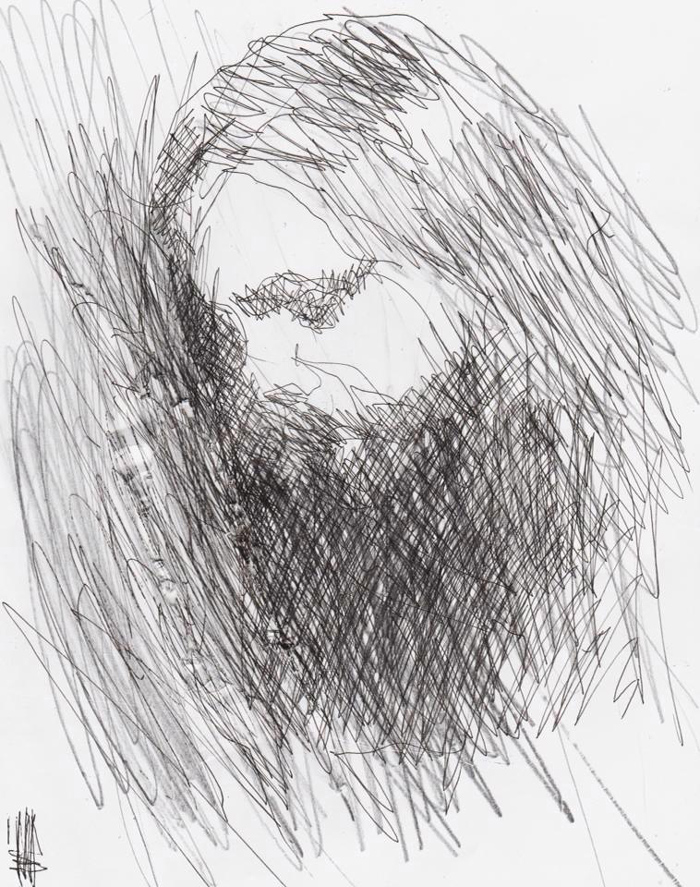
    Portrait of the artist Chet Zar
    Portrait of the artist Chet Zar

    Born in 1984, Stanislav Krawczyk comes from Kiev, Ukraine. I’m sure most of us are familiar with Kiev due to the news (briefly) talking about the civil war that is tearing the area apart. However, it’s hard to be able to look at images and video about these events and truly feel what emotions those involved must be feeling, unless of course you have some direct connection to violence of this scale. My own experience with Kiev, was back from when I used to collect cameras. The Arsenal Factory, which was used to create military equipment during World War II, was also the place many clones of Hasselblad, Zeiss, and Nikon cameras were made. It was also the place the amazing Kiev 88 medium format camera was made. Kiev is the capital city of Ukraine, and throughout history it has gone through stages of prosperity and obscurity. Now, it’s not my goal to give a history lesson on Kiev, but at least give you an idea of where this artist came from. Understanding inspiration, and specifically what has influenced Stan, is research at it’s finest.

    untitled2-stanislav

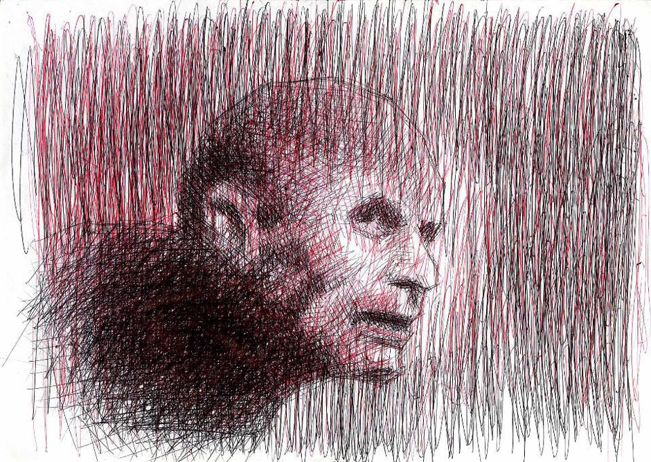
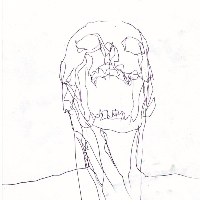
    When you look at these works, aggressively put down on paper with only ball-point pen, what you are seeing is pain, depression, fear, despair, loneliness, and it just keeps building as you see the faces peering out at you through the ink marks. These marks that look so hastily laid down, and at the same time so well thought out, are pulled right from the artists most raw emotions, with no filter to change the way they are delivered onto the paper. In some cases you can see the paper has been torn during the process. These rips and so-called imperfections are now a part of the art.

    One of the things about dark art, is that (too) often the work is dark simply for shock value. If you really study the work, not only will you witness a wealth of talented artists, but these artists are pulling from a bank of emotions that many people chose not to look at. Great dark art confronts the viewer, it holds a mirror up the things we try our hardest not to see. However, there are some things you cannot ignore, and some things that affect you so much that the only thing you can do is try your hardest to find some form of catharsis, if that is even possible. Stan was born with Cerebral palsy, which can affect movement, learning, feeling, speech, and even cause pain. A large percentage of those with CP can also have issues with their vision. Stan also has advanced Keratoconus, which can not only impair vision but create multiple images, streaking, and sensitivity to light. As stated in this article on Fangoria, Stan’s “time spent suffering in hospitals was alleviated by his mother sharing her love of horror films.” So when you look at his work, you will not only see characters pulled from the artists mind, but also those that have permeated pop culture for decades.
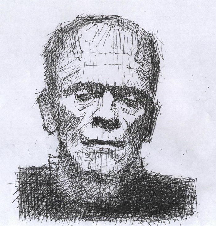
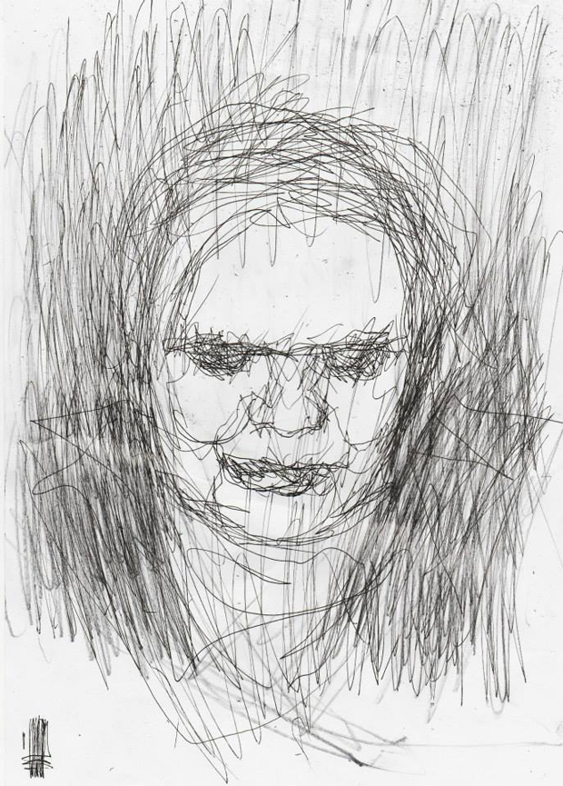
    frankenstein-stanislav

    The fact that Stan draws characters from horror movies, I think also has a deeper meaning. While these characters are aggressive, powerful—and damn cool looking—each one also has a vulnerability to them. Something that is being protected by their aggressive outer nature. Frankenstein is a great example of this, and looking at Stan’s rendition of this classic movie monster, the lines are not only forceful, but there is also this feeling that the whole drawing might fall apart if handled too roughly. The characters in horror movies have always been associated with heavy metal music for me, and others of course, and I think this is because the movies/music create this barrier between the individual and the outside world. For those that have experienced pain and suffering, having something to buffer those emotions is important. Horror movies and heavy metal do not create violent people, those that know pain and despair are simply attracted to these forms of art because they are not afraid to look at that mirror. As they say, “better the devil you know than the devil you don’t”. Dark art, horror, and dark music is the devil they know.

    The amount of work Stan has created is more than I can show in this article so please, do yourself a favor and look at the profiles linked below. You will not see overly colorful works of pop-art, but like all great horror and dark art, what you will see is art that draws you in the more you study and observe it. Each line of ink is a signature from this artist, and these works can be considered a moment of intense emotion captured on paper. Dark art at it’s most honest, fragile, and inspirational.

    A video showing some early works by Stan

    StanDarkArt Facebook Page

    See more of Stan’s available work here: StanDarkArt @ Bigcartel
    skull-standarkart

  • “Commotion” by Dorielle Caimi

    “Commotion” by Dorielle Caimi

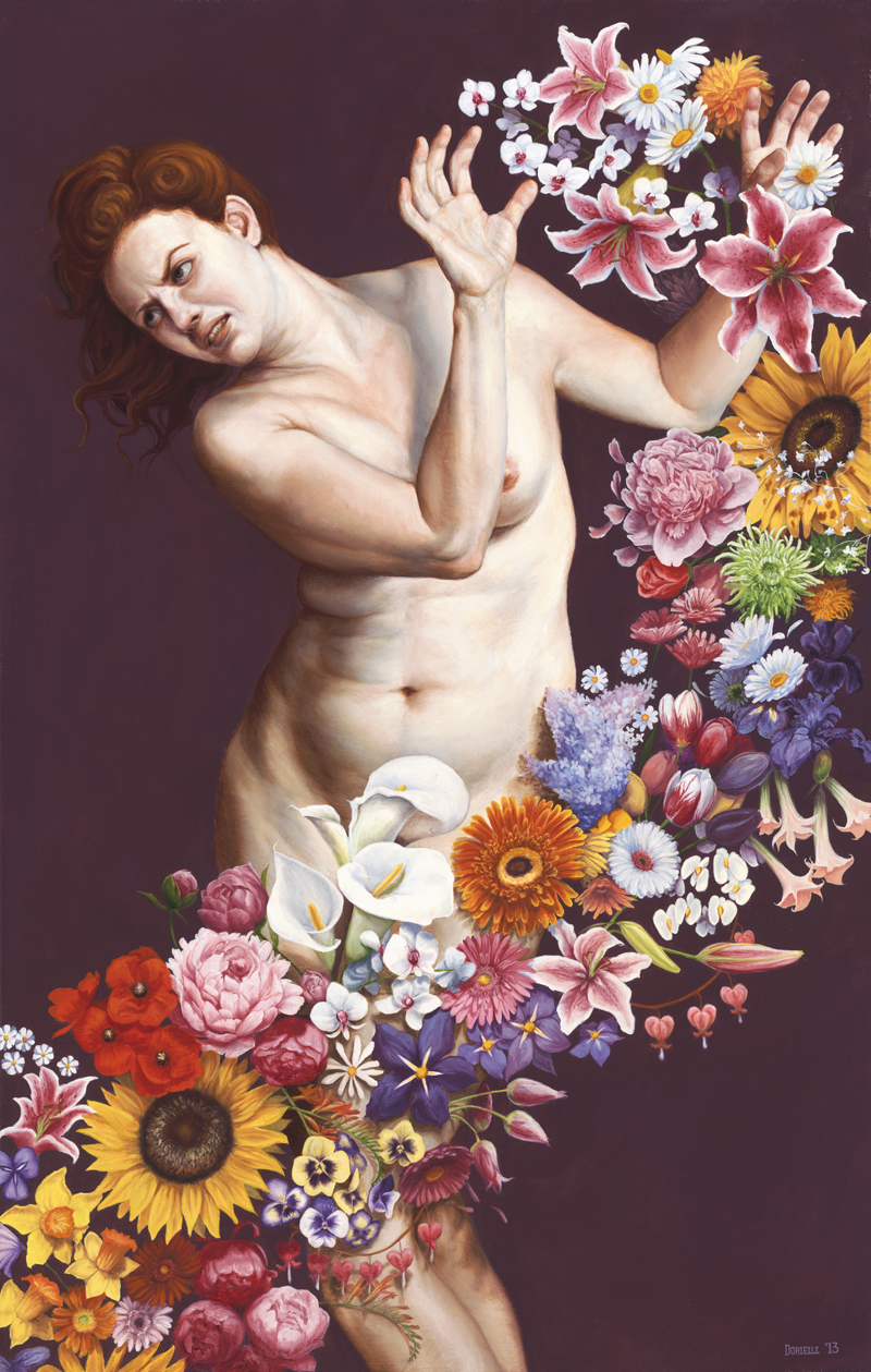
    Dorielle Caimi has a new print available entitled “Commotion”, which can be purchased by sending an email to Michelle at info@gusfordgallery.com. The great thing about this release is that she also wrote about what the painting means to her and what inspired it. I love the connection of this painting to Gentileschi’s (seen below post). I know I might be digging here, but I also noticed that the pose was reminiscent of the figure seen in “Leda and the Swan” by Da Vinci. The story is of course about Leda being seduced (raped) by Zeus, and to me this is what makes the figure Caimi has painted to exude even more strength. I could go on and on about this piece and the possible connections, but there is nothing better than the artist’s statement about the work.

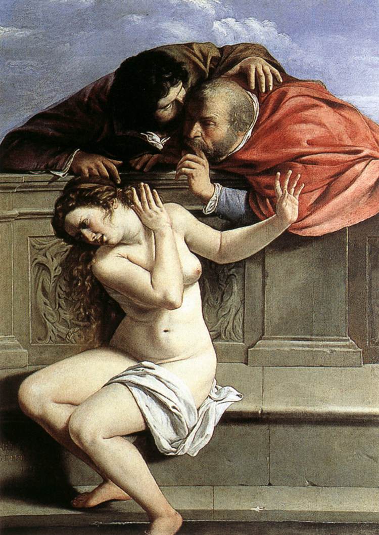
    The painting “Commotion” was initially inspired by Artemisia Gentileschi’s painting “Susanna and the Elders.” Her painting depicts a distressed bathing woman whose privacy is breeched by two leering men who desire her for her female flesh.

    As a feminist and a female artist, I wanted to put a contemporary spin on this painting by taking flowers (a stereotypical symbol of femininity) and creating a piece that illustrates the imposition of feminine societal norms on women. I sought to paint a woman with a healthy and realistic physique to illustrate her non-participation in the pressures for women to be thin and “sexy.” In the painting, she is being bombarded with a tsunami of flowers that insist that her identity is the stripped down and simple version of what it means to be female.

    For me, this painting represents the strength women possess to push away dictative societal pressures. My hope is that the figure’s expression of disgust and distress, displays her discomfort with the idea that women need to accept society’s ideals of femininity. The flowers in the painting could represent a number of things: cat-calling, Women’s Health magazine, constant apologizing, bulimia, the “Smile” command from strangers on the street, lesser wages, prying when-are-you-having-children? inquiries, and so on. If I could conjure just one reaction from my audience through this painting, it would be to just LET HER BE.

    I called the painting “Commotion” because I wanted to address exactly what I felt the flowers were doing, namely causing (as the dictionary would describe it) “a state of confused and noisy disturbance.” Just as I felt for the discomfort of Susanna, who was not okay with the violation of her privacy, as do I hope my viewers can consider that we might not be okay with all the commotion that confuses and distracts us from accessing our truest and authentic selves.

    susanna-and-the-elders-gentileschi
    Gentileschi, Artemisia. Susannah and the Elders. 1610. Oil on canvas. 1700 x 1190 mm. Collection Graf von Schoenborn, Pommersfelden

  • Audrey Kawasaki, Deedee Cheriel, and Tara McPherson at Merry Karnowsky Gallery

    Audrey Kawasaki, Deedee Cheriel, and Tara McPherson at Merry Karnowsky Gallery

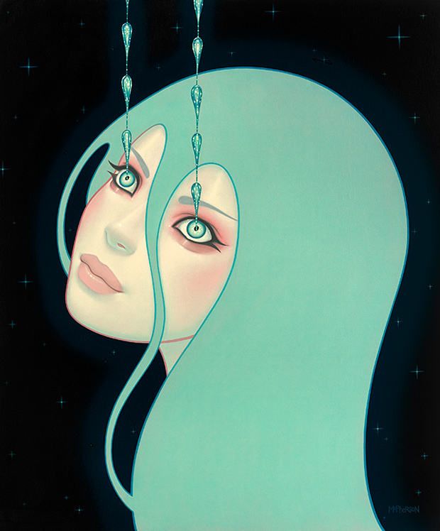
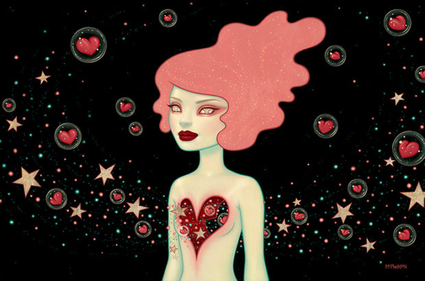
    On August 2nd, the Merry Karnowsky Gallery in Los Angeles opened three new shows; “Hirari Hirari” by Audrey Kawasaki, “In Search For More Than Another Shiny Object” by DeeDee Cheriel, and “Supernova” Tara McPherson. Looking around online, it is clear that there are a few pieces in the show that did not make onto the galleries website. You get a good idea of the new works from each artist, although I do wish the images were larger. Juxtapoz has a nice series of images (here) showing the reception and what the paintings would like in person.

    I also found a video (here) by Eric Minh Swenson that shows the reception night as well, however the focus is very much on those that attended as opposed to the art. I know it is not very exciting to watch of a video of just the artwork, but I would much rather look at the art in various angles than people I know little about.

    The show closes this August 30th. Here is a few select works from the show, and you can see the majority of the works here: Audrey Kawasaki, DeeDee Cheriel, and Tara McPherson.

    kawasaki_itwasyou

    kawasaki-mizuki

    deedee-cheriel-2

    deedee-cheriel

    mcpherson_a_tiny_universe_created_with_every_teardrop

    mcpherson_supernova

  • The Happening

    The Happening

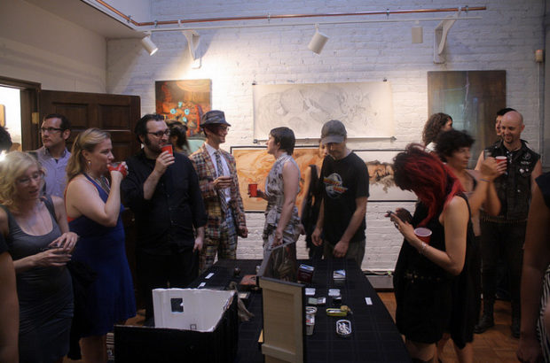
    A few years ago, my colleague and friend, artist Allison Sommers and her husband, musician and scholar, Gerrit Roessler, started to organize artist salons that took place every few months in their apartment. They were hoping to create an environment for artist friends to stretch their creative muscles.

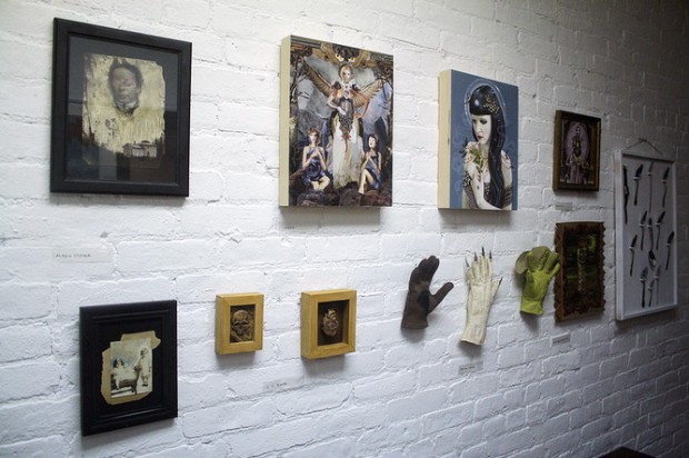
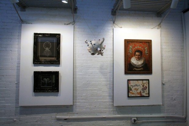
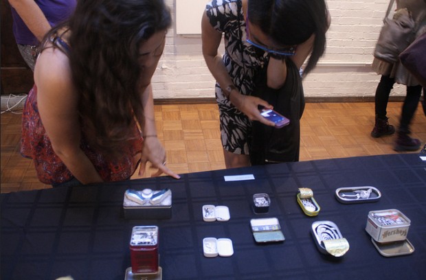
    At these salons, music has been improvised and visual art collaborations have started. There have been mini-puppet shows, presentations of computer art in development, a myriad of sketches, paintings and sculptures, clothing, prints and jewelry on view. More wondrous things than I can list. The works are often surprising. Sculptors sing and painters bring in digital art…they cross boundaries to shake up their routines and learn new things.

    TheHappening_YuriLeonov_2013_5

    Alison’s apartment is quite small, thus the parties are generally pretty small. There is a benefit to the size of these gatherings – the intimacy of them fosters a certain kind of conversation – but last year Allison thought that we might benefit from a larger gathering. The Happening was born.

    The first Happening, which took place last August at Skylight Gallery in Chelsea, Manhattan’s famed art district, was a resounding success with a packed space. We are currently in the midst of organizing our second one, which will take place on Saturday September 13th at Gristle Tattoo in Bushwick, Brooklyn. If you will be in the area, please join us. Here is the Facebook Event Page.

    TheHappening_YuriLeonov_2013_2

    I thought you might appreciate hearing from Allison directly:

    Samantha Levin for Creep Machine Magazine: What prompted you to start the salons?

    Allison Sommers: After a year or so of living in the city, I looked around and realized that I was friends with more artists than I had ever known in my life, and, furthermore, I respected their work and fed off their energy. I can’t remember what sparked the idea of starting the Salon exactly, but it grew out of this desire to see what happens when everyone gets together, shows work that noone else can see (in progress, not for public consumption) in a safe space, and mixes social life with art life until they’re indistinguishable. It’s a closed, intimate club where special things happen and joys and miseries alike are shared. Everyone sticks their neck out, and there is a power in being in art-cahoots like that. It’s a very old-fashioned sort of dream, a fin de siecle (part II) bohemian rejiggering.

    TheHappening_SamanthaLevin_2013_8

    SL: Why move to a bigger event with the happening?

    AS: It was quite organic– after a year or so of Salons, we all realized that we had something together, that there was a power to this unorganized collective that could be harnessed, or at least amplified. Having a public event also meant it was an event of inclusion, whereas the Salons are closed-door and finite (everyone must participate, and only so many can come, if nothing else but because my apartment is only so big). Very importantly, it’s an opportunity to engage in public displays of art without the confines of market or business concerns, something that comes up repeatedly as an irritant, the self-censorship and commodification of art object that plagues our ‘everyday’ work. The Happening is an art-verb for an evening, not a selling event, and it’s important to me that it remains dynamic.

    TheHappening_YuriLeonov_2013_3

    SL: What are you hoping it will develop into?

    AS: Gerrit and I have long, feverish, arm-waving discussions about what we want to do in New York with art and artists. I think that we (and our Salon/Happening compatriots) are very frustrated with the art market and scene that we engage with on a regular basis, and I really think that it’s up to us to bludgeon our worlds into our liking. There are plans for more solidification of collective, more organization of art-political action, but only time will tell whether it’s pie in the sky thinking or merely ideas that are waiting to be actualized. It’s better when it’s a bit of both, I guess.

    Learn more about The Happening Here: http://thehappeningnyc.tumblr.com/

    TheHappening_2013_ZoeWilliams

    TheHappening_2013_AllisonSommers

  • The Dunwich Horror Illustrations by Santiago Caruso

    The Dunwich Horror Illustrations by Santiago Caruso

    In 2008, Barcelona publisher Libros del Zorro Rojo, released El Horror de Dunwich (The Dunwich Horror) by H.P. Lovecraft with illustrations by Santiago Caruso. Not only is this an great story by Lovecraft, but this is one of those examples in which the art fits the story so perfectly. It reminds me of Scary Stories To Tell In The Dark, and that amazing art by Stephen Gammell. In these cases, not only does the story make a connection with the reader, but the art as well. Take a look as the gallery below, and if you are interested in buying the book you can get it here: Libros del Zorro Rojo @ BigCartel

  • “Perverse Foil”, Dan Quintana and Karen Hsiao @ Marcas Gallery

    “Perverse Foil”, Dan Quintana and Karen Hsiao @ Marcas Gallery

    On August 2nd, Marcas Contemporary Art in Santa Ana, CA, opened a show entitled “Perverse Foil” which features new works by Dan Quintana & Karen Hsiao. There isn’t a web gallery for viewing the work, only a pdf catalog. While the images are not as large and high-res as I would enjoy, the show is well worth checking out. If you are in the area, the exhibition closes on August 31st.

    Marcas Gallery

    Dan-Quintana-Clouded2

    Dan-Quintana-Foil

    Dan-Quintana-Levee

    Hsiao-Quintana

    karenhsiao-clutch1

    karenhsiao-mint

    karenhsiao-pink

  • Contemporary Contemporary Group Show @ Gauntlet Gallery

    Contemporary Contemporary Group Show @ Gauntlet Gallery

    On August 2nd, 2014, Gauntlet Gallery in San Francisco opened a group show entitled “Contemporary Contemporary”. which features up and coming artists paying homage to artists from the past 50 years. It is no doubt that present day artists are inspired by those early contemporary artists such as Lichtenstein, Warhol, and even street artists like Banksy. The show features new work by Adam Ziskie, Bethany Marchman, Brooke Grucella, Cam Floyd, Christopher Blackstock, Dan Christofferson, David Blake, David Natale, Emily Burns, Epyon5, Famous When Dead, Gene Guynn, Graham Curran, Isaac Pierro, Jason Hernandez, Jimmy C, Johannah O’Donnell, JoKa, Jonny Ruzzo, Justin Hopkins, Kareem Rizk, Kieran Collins, Marcos LaFarga, Michael McConnell, MJ Lindo, Mr. Frivolous, Robert Bowen, Ruben Ireland, Serge Gay Jr., Shannon Freshwater, Syd Bee, Vincent Cacciotti & William Arvin. The exhibition will run until August 19th, take a look at the preview below and off to the gallery’s website for more: Gauntlet Gallery

    rumors-vincentcaccioti

    skulllewitt-adamziskie

    PictureThis-JohannahODonnell

    ListlessandtheIronLung-JustinHopkins

    ForTheLoveOfSamo-RubenIreland

  • The Black Lodge by Tom Bagshaw

    The Black Lodge by Tom Bagshaw

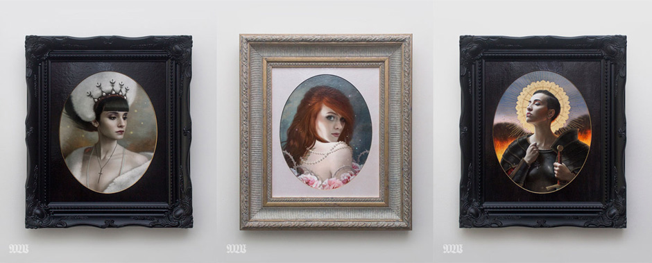
    3xframed1-bagshaw

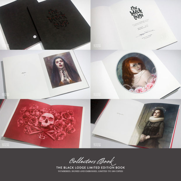
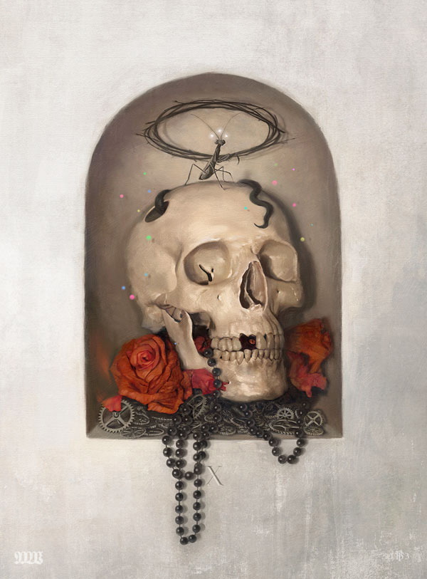
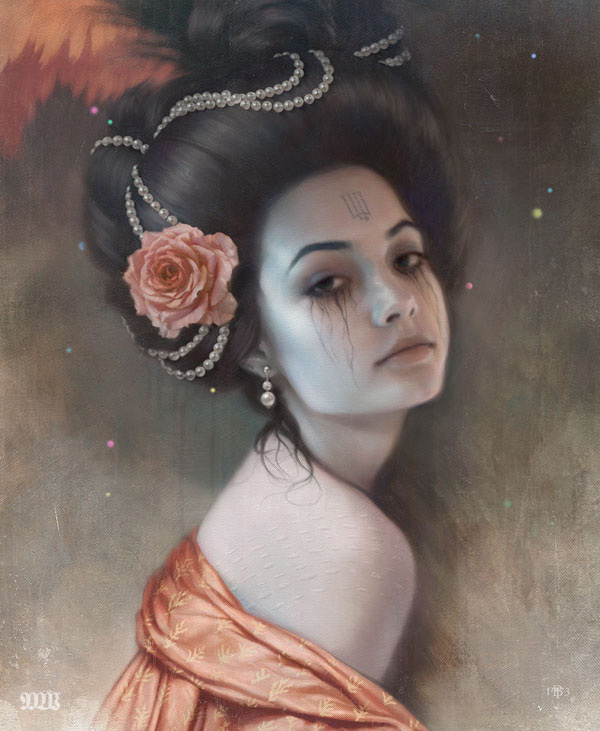
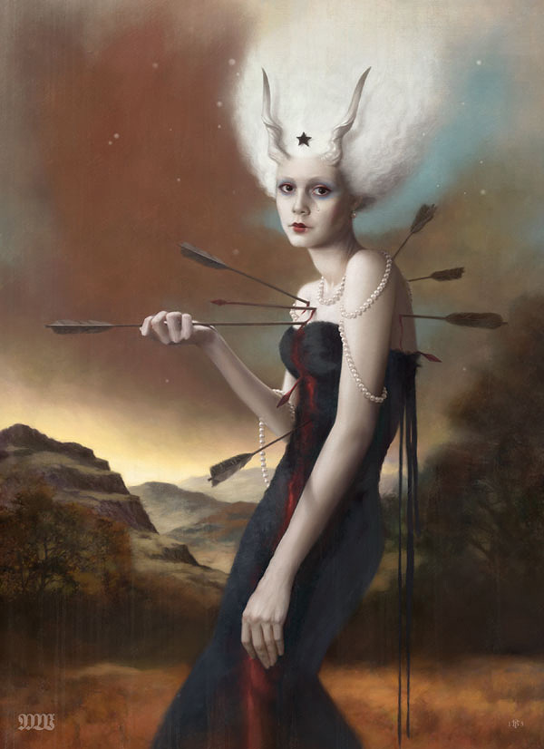
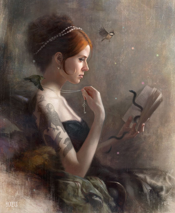
    For the past year and half, Tom Bagshaw has been working on a inspiring project entitled “The Black Lodge”, setting out to create a series of portraits that would only be available through his online shop. Along with the framed, one-off digital prints, there is also a limited edition book available with the collected series of portraits and additional complimentary works. The book is limited to an edition of 100 and is numbered, signed, and embossed. The following is an intro by Tom about this exciting series.

    The whole project really came about as an experiment to see whether I could get some volunteer models for my work via Instagram. I had a rough idea that I wanted to produce some darker themed portraits, and finding suitable models always causes me no end of problems. So at the beginning of January 2013, I put up an ad on Instagram asking for some volunteers for the project. I was pretty amazed by the response; I ended up with 800+ people putting themselves forward over a weekend! After 48 hrs I went through every single picture and profile and selected a group of models, thanking everyone else for volunteering.

    I sent each of the models a rough sketch of a pose and got them to take some basic photo reference shots. Then I went ahead and started working on one portrait at a time. Obviously, because it was a personal project I had to fit it in around commissions and exhibition work. To produce the 18 portraits, together with 5 complimentary pieces, it ended up taking a year and a half. The main idea was to produce one off portraits that would be sold via my online store rather than as a gallery exhibition, purely in an effort to create works that would (hopefully) be within reach of a wider collectors market. I also wanted to produce a show catalogue or book that would collate the series, essentially making mini prints available to those who could not afford or missed out on the framed works.

    In the end I was able to produce a 7×9.25″ perfect bound book, with a soft velvet laminate and spot UV cover, more than I originally intended but hopefully people will like it! The framed works, along with the book will be launched on the Mostlywanted Shop on the 1st August, I’ve had a lot of fun doing this project and am really pleased to see how well things are being received so far!

    Take a look at the preview below; order and see the rest of the series here: MostlyWanted

    blacklodgeBook-bagshaw

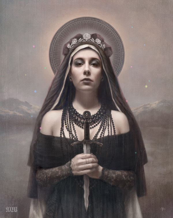
    morrigan-tombagshaw

    sacrificiumIntellectus-bagshaw

    pressureOverTime-bagshaw

    phulsBride-bagshaw

    martyre-bagshaw

    lostThoughts-bagshaw

    hlin-bagshaw