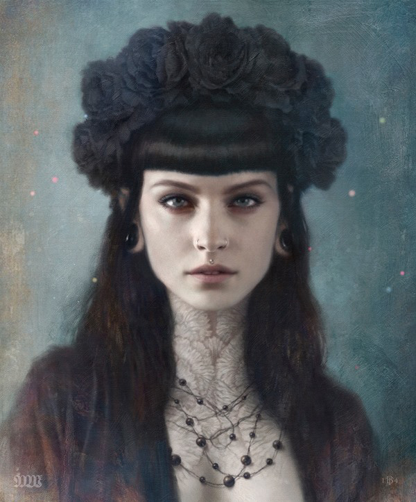
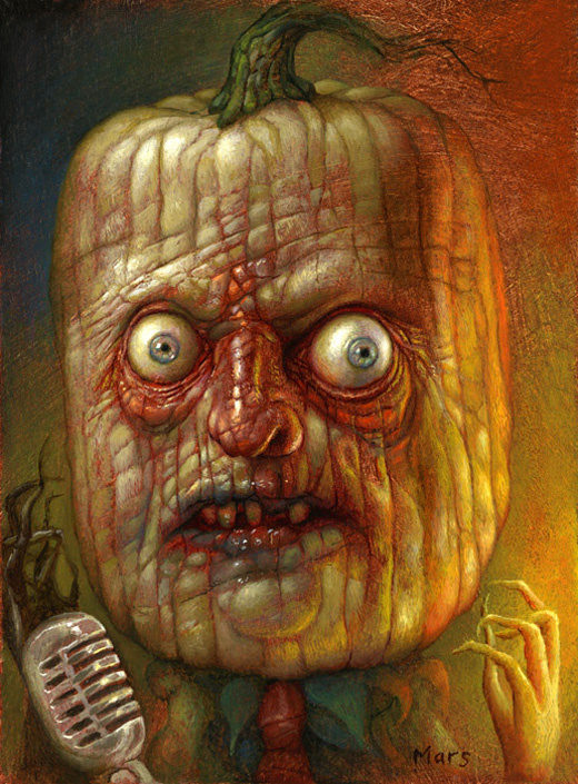
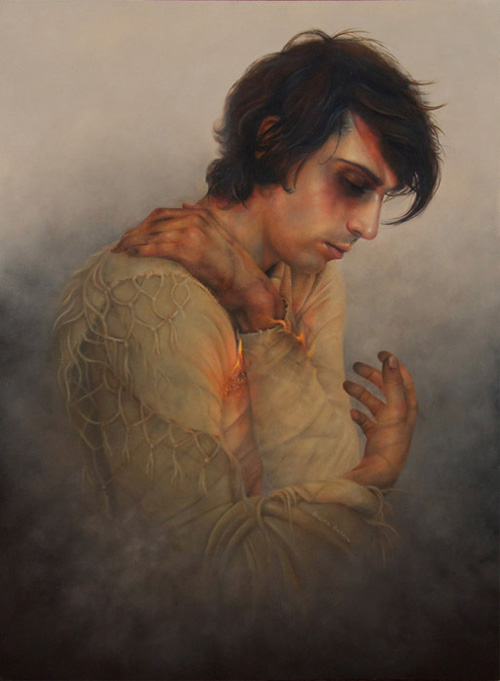
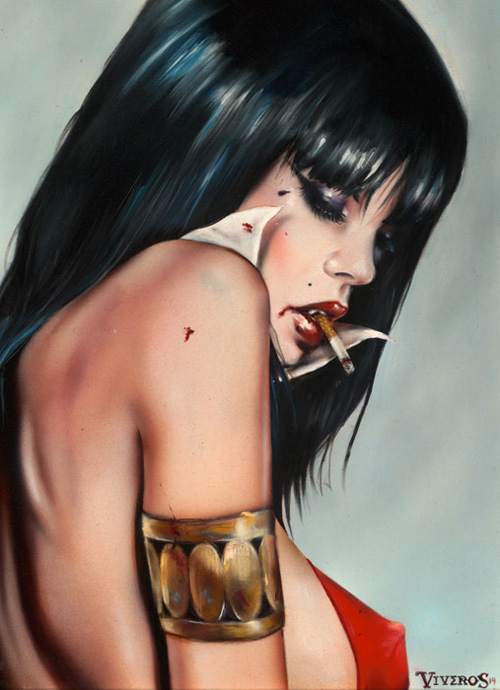
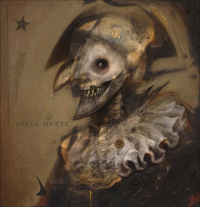
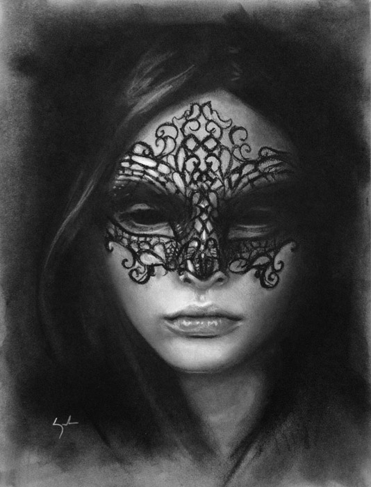
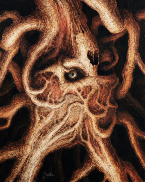
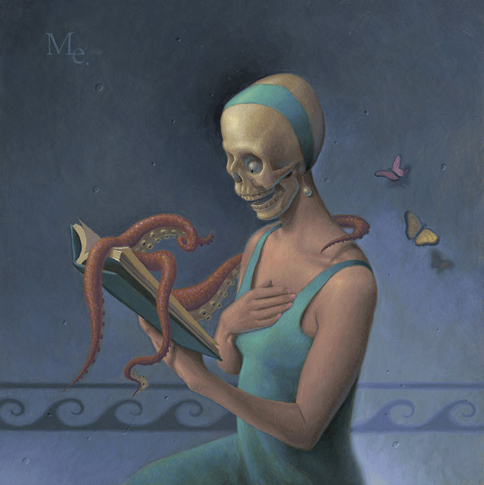
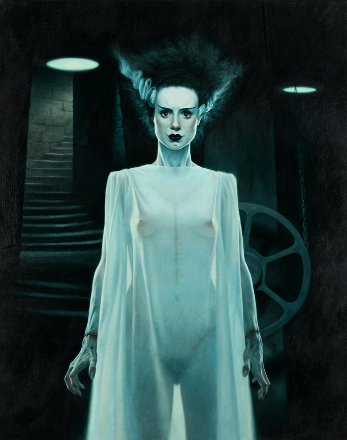
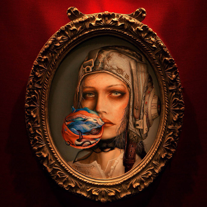
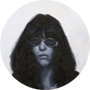
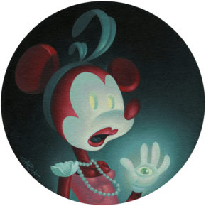
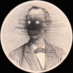
Tradition here on the site, even though we have missed a year, is to have a Halloween Art Feature. This year we have art by a great lineup of artists including: Augie Pagan, Chris Mars, Chet Zar, Jaime Lee Parker, Tim Bruckner, Jason Hite, Menton J Mathews, Colin Christian, Mike Bell, Alex Gross, Randy Ortiz, David Stoupakis, Dan Harding, Dean McDowell, Tom Bagshaw and Bennett Slater.
(Click for Larger Image, Use Arrow Keys to Browse, ESC to end slideshow)
On October 11th, the Last Rites Gallery in New York opened the 7th installment of their 13th Hour Group Exhibition. Last Rites is one of those galleries that I find myself awed at every show they host, and the 13th Hour shows are often the most awe inspiring. It is these shows that you not only see a diverse range of art, but you are looking at the some of the best artists that dark surrealism has to offer. As I scoured through this years offering, I found myself wanting to share every image from this show, and even learned of a few artists that I have not had my eye on before.
The 6th edition of this show features the work of Tom Bagshaw, William Basso, Nick Baxter, Dilka Bear, Paul Booth, Matt Buck, John Cebollero, Chrystal Chan, Crajes, Craww, Matt Dangler, Brian Despain, Thomas Dodd, Mark Elliot, Jacub Gagnon, Mark Garro, Jason Goldberg, Jessica Gordon, Naoto Hattori, Fay Helfer, Kelley Hensing, Robert Hernandez, Jeremy Hush, Jessica Joslin, JoKa, Sarah Joncas, Jean Labourdette aka Turf One, Eric Lacombe, Jed Leiknes, Matthew Levin, Brin Levinson, Eli Livingston, Ver Mar, Chris Mars, menton3, Vince Natale, Chris Peters, Dan Quintana, David Richardson, Paul Romano, David Stoupakis, Tin, Emma Tooth, Nicomi Nix Turner, Brian Viveros, Allen Williams, Daniel Williams, N.C. Winters, Hannah Yata, Vincent Xeus, and Kate Zambrano.
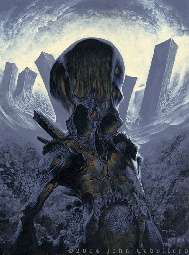
Opening this Saturday, October 11th at the Last Rites Gallery is their annual group show “The 13th Hour”. As always there will be some inspiring artists showing new work, and we are lucky to have an exclusive preview of a new piece for the show by John Cebollero entitled “Black Rooster”. I chatted with John for a bit, and he gave us a quick writeup of what inspired this piece.
As time has gone by, I’ve wanted more of my “paintings” to be more spontaneous in their conception…….
Not so premeditated…..
The idea of sitting down and meticulously plotting out an image doesn’t appeal to me….
This image, for instance, was not drawn out first in pencil…..
I just painted a VERY rough indication with paint and fleshed it out from their….
What I’ve been trying to achieve is very much in the vein of Zdzislaw Beksinski.
Tormented souls exiled to a land of despair.
A place of sulfur & rot.
Where rot sets in before death.
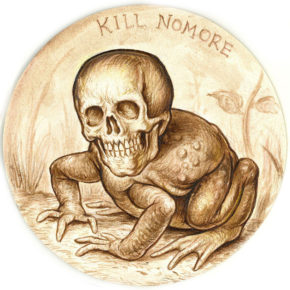
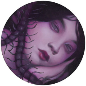
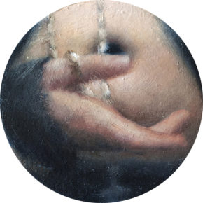
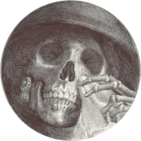
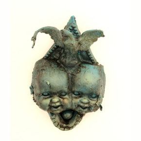
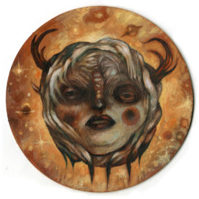
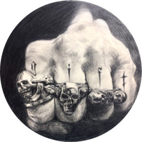
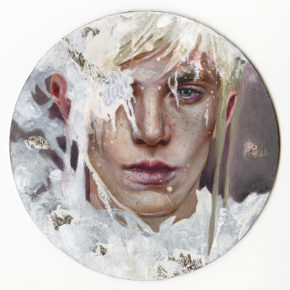
On September 5th, 2014, the 2nd Annual Coaster Show opened at La Luz de Jesus in Los Angeles, CA. Each artist was supplied 4″ Tondo Coasters, courtesy of the fine people at L.A. Beer Week. The only rules they needed to follow, was that each piece must be a solitary work and must be priced $250 or less. Last year the show featured over 700 tiny works of art and this year they decided to outdo that by showcasing over 1000 works of art.
It’s easy to dismiss something as tiny as a beer coaster to be something that would allow for great art, but this years show—and last years to be honest—proved that tiny works of art can be just as exciting as larger works can. I love seeing what each artist was able to do with the limited area. Many artists stayed within the 4″ diameter, but I was happy to see that quite a few such as Peter Adamyan, Caitlin Anne Drop, Matthew Dutton, and Jeff Gillette, used the coaster as a support to create a larger 3-dimensional piece.
There are so may works in this show, it was pretty hard to choose a selection here to feature. I kept telling myself to not pick too may but then there would be another coaster I had to share. Lee Joseph has a great Flickr album (here) showing how the gallery went about installing this unique show. The exhibition runs until September 28th, so if you’re in the area make sure to stop by. Otherwise, take a look at our preview and then head over to the gallery’s homepage for the full show: 2nd Annual Coaster Show at La Luz de Jesus
(Click for Larger Image, Use Arrow Keys to Browse, ESC to end slideshow)
White Noise by Alessia Iannetti
The Queen by Zoe Lacchei
Pisces by Jessica Ward
Kill No More by Christopher Ulrich
Bad Dream by Syd Bee
Sutherland by Stephanie and Stephen Somers
The Rosary by Shaun Berke
The Widow by Horacio Martinez
Blood Brothers by Matthew Dutton
Number 1 by Nathan Ota
Through the Looking Glass by Patricia Ariel
Migratory Seraphic Oracle by Peter Goode
Stages of Enlightenment by Michael Mararian
Gift by Lizz Lopez
Little Galaxy by Kaspian Shore
Merry by JoKa
Joey Ramone by John Wentz
Poacher by John Cebollero
Flesh for Fantasy by Gabe Larson
The Hoodoo Lady by Gabi de la Merced
Are You Sure by Italia Ruotolo
Drink Till It’s Marilyn Monroe by Jackie Gallagher
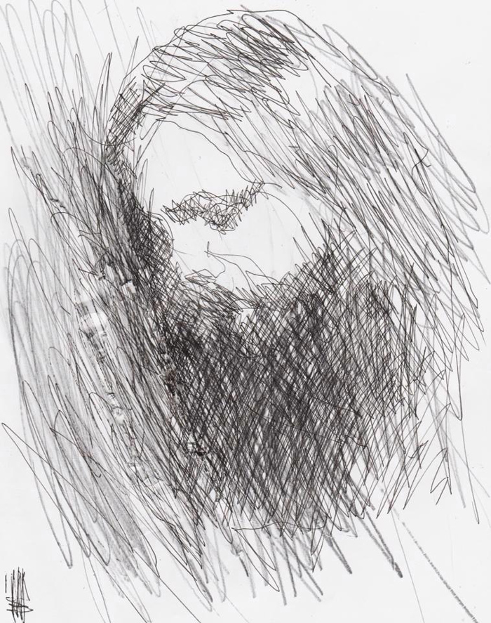
Over the years of looking at art, I have often thought about what medium tends to contribute most to the emotion a work of art can hold. Looking at art is a very personal and objective thing, so instead of making a generalized statement, I can only think of what mediums catch my eye and help deliver the message I am seeing in the works. My experience with each medium tends to sway what I am feeling. For instance, gouache is so hard for me to mix properly, I often imagine the artist has a great deal of patience and is meticulous in the way they work. Acrylics give me the impression of allowing for more aggression, and oils will always come off as fragile and elegant to me, no matter how dark or confrontational the work may be. Charcoal has the ability to create a mood that can quickly consume me, this is most evident when I look at works by Kathe Kollwitz. I love graphite and ink works, but up until recently I have not associated as many feelings with ink/graphite as I do when I look at the drawings of Stanislav Krawczyk .
Portrait of the artist Chet Zar
Born in 1984, Stanislav Krawczyk comes from Kiev, Ukraine. I’m sure most of us are familiar with Kiev due to the news (briefly) talking about the civil war that is tearing the area apart. However, it’s hard to be able to look at images and video about these events and truly feel what emotions those involved must be feeling, unless of course you have some direct connection to violence of this scale. My own experience with Kiev, was back from when I used to collect cameras. The Arsenal Factory, which was used to create military equipment during World War II, was also the place many clones of Hasselblad, Zeiss, and Nikon cameras were made. It was also the place the amazing Kiev 88 medium format camera was made. Kiev is the capital city of Ukraine, and throughout history it has gone through stages of prosperity and obscurity. Now, it’s not my goal to give a history lesson on Kiev, but at least give you an idea of where this artist came from. Understanding inspiration, and specifically what has influenced Stan, is research at it’s finest.
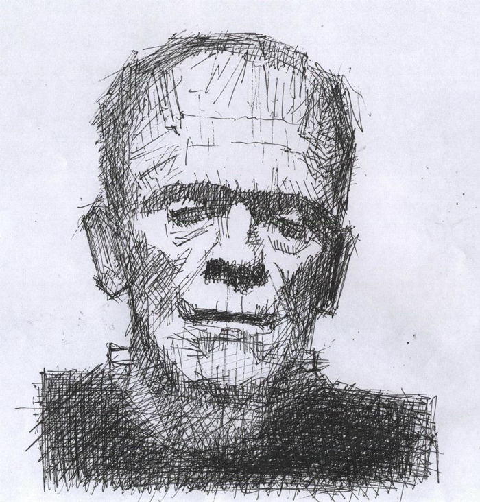
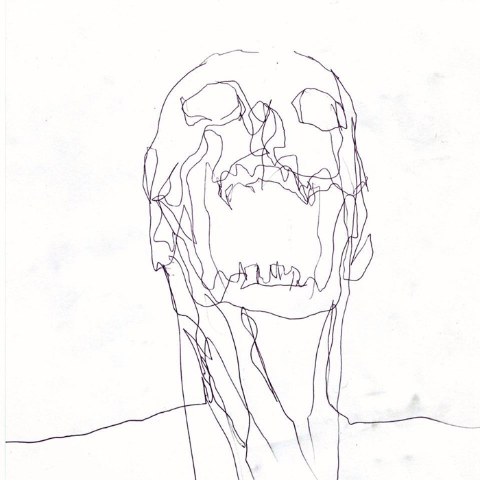
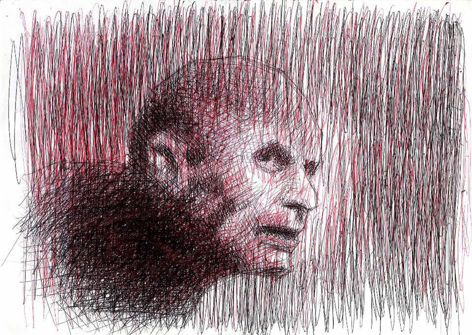
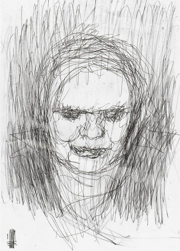
When you look at these works, aggressively put down on paper with only ball-point pen, what you are seeing is pain, depression, fear, despair, loneliness, and it just keeps building as you see the faces peering out at you through the ink marks. These marks that look so hastily laid down, and at the same time so well thought out, are pulled right from the artists most raw emotions, with no filter to change the way they are delivered onto the paper. In some cases you can see the paper has been torn during the process. These rips and so-called imperfections are now a part of the art.
One of the things about dark art, is that (too) often the work is dark simply for shock value. If you really study the work, not only will you witness a wealth of talented artists, but these artists are pulling from a bank of emotions that many people chose not to look at. Great dark art confronts the viewer, it holds a mirror up the things we try our hardest not to see. However, there are some things you cannot ignore, and some things that affect you so much that the only thing you can do is try your hardest to find some form of catharsis, if that is even possible. Stan was born with Cerebral palsy, which can affect movement, learning, feeling, speech, and even cause pain. A large percentage of those with CP can also have issues with their vision. Stan also has advanced Keratoconus, which can not only impair vision but create multiple images, streaking, and sensitivity to light. As stated in this article on Fangoria, Stan’s “time spent suffering in hospitals was alleviated by his mother sharing her love of horror films.” So when you look at his work, you will not only see characters pulled from the artists mind, but also those that have permeated pop culture for decades.
The fact that Stan draws characters from horror movies, I think also has a deeper meaning. While these characters are aggressive, powerful—and damn cool looking—each one also has a vulnerability to them. Something that is being protected by their aggressive outer nature. Frankenstein is a great example of this, and looking at Stan’s rendition of this classic movie monster, the lines are not only forceful, but there is also this feeling that the whole drawing might fall apart if handled too roughly. The characters in horror movies have always been associated with heavy metal music for me, and others of course, and I think this is because the movies/music create this barrier between the individual and the outside world. For those that have experienced pain and suffering, having something to buffer those emotions is important. Horror movies and heavy metal do not create violent people, those that know pain and despair are simply attracted to these forms of art because they are not afraid to look at that mirror. As they say, “better the devil you know than the devil you don’t”. Dark art, horror, and dark music is the devil they know.
The amount of work Stan has created is more than I can show in this article so please, do yourself a favor and look at the profiles linked below. You will not see overly colorful works of pop-art, but like all great horror and dark art, what you will see is art that draws you in the more you study and observe it. Each line of ink is a signature from this artist, and these works can be considered a moment of intense emotion captured on paper. Dark art at it’s most honest, fragile, and inspirational.
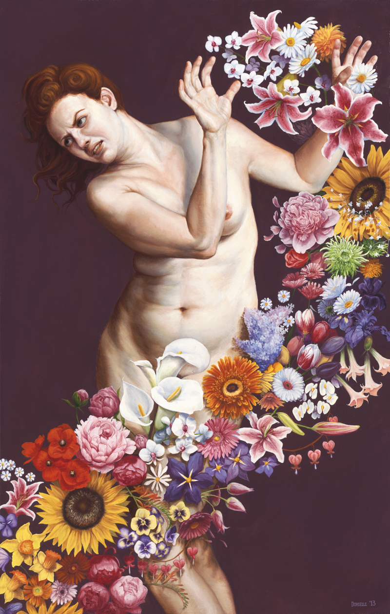
Dorielle Caimi has a new print available entitled “Commotion”, which can be purchased by sending an email to Michelle at info@gusfordgallery.com. The great thing about this release is that she also wrote about what the painting means to her and what inspired it. I love the connection of this painting to Gentileschi’s (seen below post). I know I might be digging here, but I also noticed that the pose was reminiscent of the figure seen in “Leda and the Swan” by Da Vinci. The story is of course about Leda being seduced (raped) by Zeus, and to me this is what makes the figure Caimi has painted to exude even more strength. I could go on and on about this piece and the possible connections, but there is nothing better than the artist’s statement about the work.
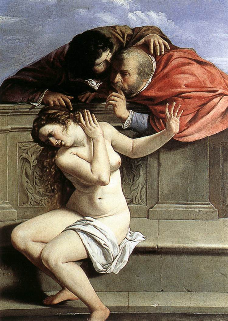
The painting “Commotion” was initially inspired by Artemisia Gentileschi’s painting “Susanna and the Elders.” Her painting depicts a distressed bathing woman whose privacy is breeched by two leering men who desire her for her female flesh.
As a feminist and a female artist, I wanted to put a contemporary spin on this painting by taking flowers (a stereotypical symbol of femininity) and creating a piece that illustrates the imposition of feminine societal norms on women. I sought to paint a woman with a healthy and realistic physique to illustrate her non-participation in the pressures for women to be thin and “sexy.” In the painting, she is being bombarded with a tsunami of flowers that insist that her identity is the stripped down and simple version of what it means to be female.
For me, this painting represents the strength women possess to push away dictative societal pressures. My hope is that the figure’s expression of disgust and distress, displays her discomfort with the idea that women need to accept society’s ideals of femininity. The flowers in the painting could represent a number of things: cat-calling, Women’s Health magazine, constant apologizing, bulimia, the “Smile” command from strangers on the street, lesser wages, prying when-are-you-having-children? inquiries, and so on. If I could conjure just one reaction from my audience through this painting, it would be to just LET HER BE.
I called the painting “Commotion” because I wanted to address exactly what I felt the flowers were doing, namely causing (as the dictionary would describe it) “a state of confused and noisy disturbance.” Just as I felt for the discomfort of Susanna, who was not okay with the violation of her privacy, as do I hope my viewers can consider that we might not be okay with all the commotion that confuses and distracts us from accessing our truest and authentic selves.
Gentileschi, Artemisia. Susannah and the Elders. 1610. Oil on canvas. 1700 x 1190 mm. Collection Graf von Schoenborn, Pommersfelden
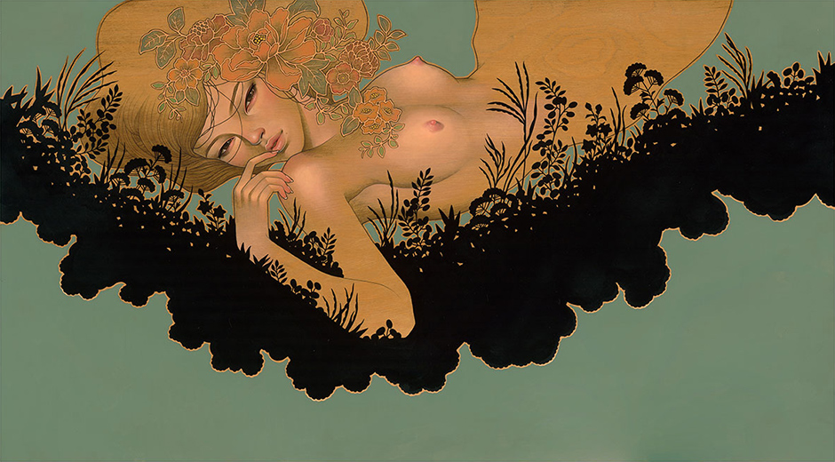
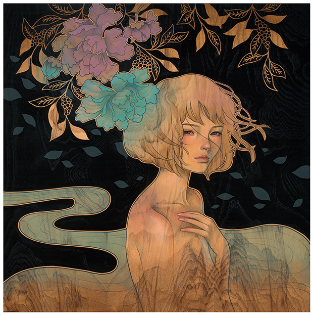
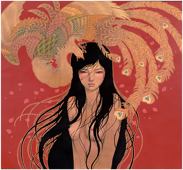
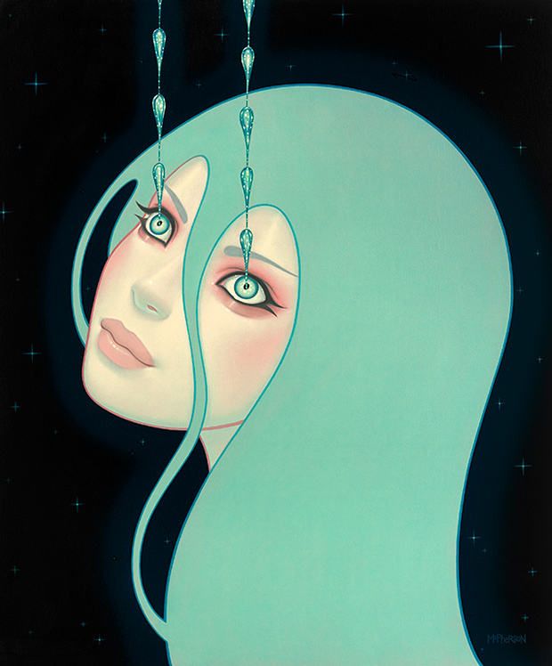
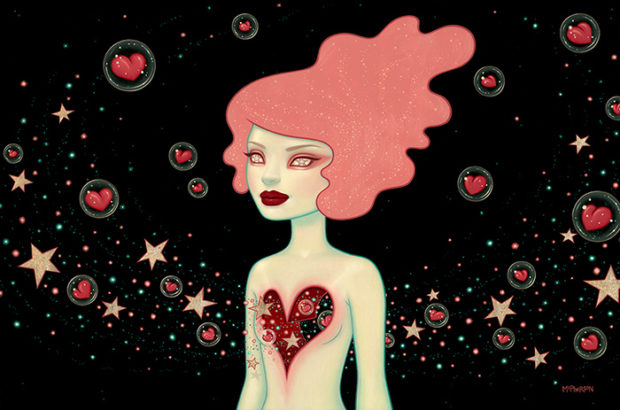
On August 2nd, the Merry Karnowsky Gallery in Los Angeles opened three new shows; “Hirari Hirari” by Audrey Kawasaki, “In Search For More Than Another Shiny Object” by DeeDee Cheriel, and “Supernova” Tara McPherson. Looking around online, it is clear that there are a few pieces in the show that did not make onto the galleries website. You get a good idea of the new works from each artist, although I do wish the images were larger. Juxtapoz has a nice series of images (here) showing the reception and what the paintings would like in person.
I also found a video (here) by Eric Minh Swenson that shows the reception night as well, however the focus is very much on those that attended as opposed to the art. I know it is not very exciting to watch of a video of just the artwork, but I would much rather look at the art in various angles than people I know little about.
The show closes this August 30th. Here is a few select works from the show, and you can see the majority of the works here: Audrey Kawasaki, DeeDee Cheriel, and Tara McPherson.
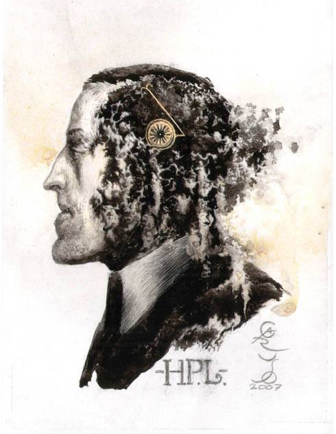
In 2008, Barcelona publisher Libros del Zorro Rojo, released El Horror de Dunwich (The Dunwich Horror) by H.P. Lovecraft with illustrations by Santiago Caruso. Not only is this an great story by Lovecraft, but this is one of those examples in which the art fits the story so perfectly. It reminds me of Scary Stories To Tell In The Dark, and that amazing art by Stephen Gammell. In these cases, not only does the story make a connection with the reader, but the art as well. Take a look as the gallery below, and if you are interested in buying the book you can get it here: Libros del Zorro Rojo @ BigCartel