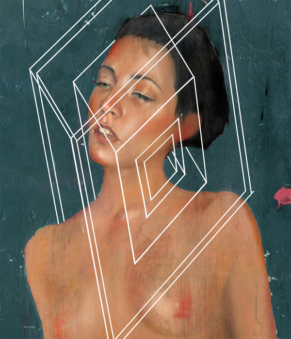
Diego Fernandez is an artist working out of Buenos Aires, Argentina. He is primarily a digital artist, although you wouldn’t think so by the quality his work has. I have seen some amazing digital illustrations that really fool the eye into believing they were made with oils, watercolors, and even graphite, but these works by Fernandez really had me believing they were acrylic washes. Even though, in many of his works he uses digital programs, it doesn’t seem to matter. I think it is very impressive, that he is at a skill level in which the medium is either unknown, or unimportant. Check out the rest of his work at his portfolio below:
Blog
-
Prints: “Twisted Fate” by Dan May with a contest
Dan May will be is releasing a new print this week, but there is a cool twist. Anyone who purchases this print will be automatically entered in a drawing to win the original, and more you can even get entered more than once for more that one purchase. The print, “Twisted Fate” is from a painting Dan contributed to the Craola curated group show “INLE”, and is 8″ x15″ on 11″ x 17″ Canson Etching Photo Rag. The print is only available for a two week period, so the amount of sales determines the edition. The original painting is roughly the same size, 9″ X 18″ acrylic on panel, 14″ X 23″ framed. The print drops tomorrow, June 15th at 2pm PST.
Get it here: Dan May Shop

-
New work by Erik Jones
Erik Jones (featured), an artist I have not shown on the site in quite a long time, has come out with a bunch of new work. He also recently had a solo show, “Pop Op” at Redletter 1 this past June 3rd. The work has yet to show up online in entirety, however he has released some images on his various profiles. Erik’s traditional works, no less exciting than anything digital he creates, is made of a myriad of materials such as watercolors, colored pencils, water based oils, nu-pastels, and acrylics on Rives BFK paper. If there was ever a paper that could be called exquisite it’s Rives BFK. James Jean uses it a lot, and Erik Jones used it for these new works that, as you can see, are exquisite in themselves. I love the blend of figurative imagery, abstract shapes, and textures that each piece holds. Makes sure to keep an eye on his website, Deviantart Profile and blog for more work and updates. Here is what Erik said about this new series of works:
“This new “thing” that I’m doing is really just about experimenting.
Though the figures tend to be “attractive”, the new direction places less emphasis on sexuality. I simply start out with a loose line drawing of a figure and experiment with building up and breaking down color and shapes in and around said figure. It is not only a salubrious experimentation with the figure but also an exploration of mediums. This process is more sporadic and embraces imperfection, rather then focusing mainly on rendering “perfect” realistic skin.
…It’s also a lot of fun.”


-

“Double Vision” group show Curated by EGO @ Bherd Studios Gallery
Seattle based artist EGO (featured) was asked to curate a show at the Bherd Studios Gallery in Seattle, and came up with a unique idea for the show. 8 artists were chosen, each one created a piece of art with no restraints, and then EGO drew names from a hat and each artist reinterpreted the painting they were drawn with. So for instance EGO worked from an Amy Huddelston painting while Amy worked from a John Osgood painting. It’s a killer idea and one that I hope to see more often. The work doesn’t seem to be online yet, but I was sent a couple of images to share here. The show features works by EGO, Amy Huddleston, NKO, Solace, Wayne Liostro, John Osgood, 179, and Parskid.


-
Preview: Joshua Petker “Celluloid Constellations” @ Corey Helford Gallery
This Saturday night, June 11th at the Corey Helford Gallery, a duo show opens with the main solo show featuring new works from Nouar and a small show from Joshua Petker entitled “Celluloid Constellations”. This new exhibition features paintings inspired by the Golden Age of Hollywood. Platinum Cheese has a small interview with Joshua Petker about this show and the inspiration for it. Check out the preview images and then keep your eye on the gallery’s site for the full show.
-
Prints: “The Rescue” by Amy Sol
Amy Sol is releasing a new print this Saturday, June 11th at a random time. The print is entitled “The Rescue” and is 11.5″ x 15″, hand embellished, signed and numbered in an edition of 50. Each print also comes with a certificate of provenance.
Get it here: Amy Sol Store


-
Prints: “Red Soil” by Martin Wittfooth @ A Paper Tiger
One of the newest changes to the Creep Machine in the coming weeks, is the frequency of print related posts. I am going to bring the amount of print release posts to a minimum. There are already many sites that feature new print releases, and this was never the impetus of the site to begin with. Outstanding, top notch prints I will always share such as this new one from Martin Wittfooth. Entitled “Red Soil”, this new print is a generous 16.5″ x 24″ on Archival cotton rag fine art paper, signed and numbered in an edition of only 15. This is a beautiful image, and one of the best prints I have seen from Wittfooth.
Get it here: Martin Wittfooth @ Paper Tiger

-
“They Live” poster by Shepard Fairey
Just a day ago I posted news on a “They Live” poster by Shepard Fairey from Alamo Drafthouse . The poster was released on Mondotees and in record time, as always with the prints they release, it sold out in minutes. “They Live” is one of my favorite movies, along with another Carpenter classic “The Thing”. There has already been quite a lot of art created that was inspired by “They Live”, much of it is OK not amazing. With the secrecy and hype for this print I was really expecting something outstanding, the stencil photo even got you prepared for it. Once the final image was released however, I wasn’t blown away and I noticed many fans weren’t either. I tried to figure out why there is something off about this print and I think I figured it out. It has the same color palette and textures that make so many of Fairey’s prints look as good as they do, and since he has used the Obey imagery from this movie quite a lot it should be a perfect fit. I think the problem is that while this is supposed to be a “They Live” poster, something to commemorate the movie itself, it looks more like a Shepard Fairey print with the “They Live” title and credits added as an afterthought. What do you think?


